Data exploration
In this tutorial, we will analyze a dataset related to diabetes using the crandas library. We will import the necessary libraries, load the datasets, and then perform some data analysis tasks.
First, let’s import the required libraries:
import crandas as cd
import pandas as pd
import math
from tabulate import tabulate
import matplotlib.pyplot as plt


# Set the colours for our MatPlotLib charts
plt.rcParams['axes.prop_cycle'] = plt.cycler('color', ['#ec297b', '#4f89d6', '#03186b', '#343434', '#9467bd', '#8c564b', '#e377c2', '#7f7f7f', '#bcbd22', '#17becf'])
Step 1: Accessing the Data
Now, let’s load the datasets. There are three CSV files that we will be working with. We assume that each of them contains medical data about patients with diabetes, provided by different hospitals.
Note
In a real world scenario, each hospital would upload their own data and here we would simply retrieve it from the engine. In this example, we simply upload all three databases ourselves.
file1 = "data/diabetes_data/diabetes_dummy_1.csv"
file2 = "data/diabetes_data/diabetes_dummy_2.csv"
file3 = "data/diabetes_data/diabetes_dummy_3.csv"

dataset_1 = cd.read_csv(file1).save(name="dataset_1")
dataset_2 = cd.read_csv(file2).save(name="dataset_2")
dataset_3 = cd.read_csv(file3).save(name="dataset_3")
Let’s check the structure of the first dataset:
>>> print(repr(dataset_1))
    Name: 753CEC55C6CDD2E2B6D98455E0C35F6D57837B103252E864853403FAF3A47728
    Size: 100 rows x 18 columns
    CIndex([Col("Patientnr", "i", 1), Col("M/V", "i", 1), Col("Leeftijd", "i", 1), Col("patient_sims", "i", 1), Col("zorgprofiel", "i", 1), Col("Hoofdbehandelaar", "i", 1), Col("Podotherapeut huisbezoek", "i", 1), Col("Pedicure huisbezoek", "i", 1), Col("DM Type", "i", 1), Col("Tekenen van infectie", "i", 1), Col("Ulcus/amputatie", "i", 1), Col("Inactieve charcot-voet", "i", 1), Col("Nierfalen/Dialyse ", "i", 1), Col("Pulsaties links ", "i", 1), Col("Pulsaties rechts", "i", 1), Col("Doppler links", "i", 1), Col("Doppler rechts", "i", 1), Col("Huidig schoeisel", "i", 1)])
Step 2: Exploring the Data
First, we want to find how much of each dataset contains information of Type 1 diabetes and how much of it contains information about Type 2. For this, we filter by type using "dataset[DM Type"]==1 and sum the total number of entries using sum. Then we divide that by the size of each dataset.
# Print the question
print("What is the relative ratio between both types of diabetes in each dataset? \n")

# Define the column headers for the table
headers=["Dataset", "% DM Type 1", "% DM Type 2"]

# Define the data to be displayed in the table
table = [["Dataset 1",((sum(dataset_1["DM Type"]==1)/len(dataset_1))*100), ((sum(dataset_1["DM Type"]==2)/len(dataset_1))*100)],
        ["Dataset 2",((sum(dataset_2["DM Type"]==1)/len(dataset_2))*100), ((sum(dataset_2["DM Type"]==2)/len(dataset_2))*100)],
        ["Dataset 3",((sum(dataset_3["DM Type"]==1)/len(dataset_3))*100), ((sum(dataset_3["DM Type"]==2)/len(dataset_3))*100)]]

# Format the table using the tabulate library and print it
print(tabulate(table, headers=headers, tablefmt='psql'))
Question 1: What is the relative ratio between both types of diabetes in each dataset?

+-----------+---------------+---------------+
| Dataset   |   % DM Type 1 |   % DM Type 2 |
|-----------+---------------+---------------|
| Dataset 1 |            50 |            50 |
| Dataset 2 |            54 |            46 |
| Dataset 3 |            47 |            53 |
+-----------+---------------+---------------+
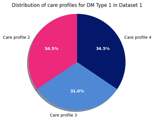
Different cases of the same type require different care profiles. Next we can create a pie chart to visualize the relative distribution of such care profiles within Type 1 Diabetes for dataset 1. We feed our open data to a plotting package to display it.
# Print the question to be answered
print("\nQuestion 2: What is the relative distribution of care profiles within a certain type of diabetes? \n")

# Specify the dataset being analyzed
print("Dataset 1 - DM Type 1")

# Define the labels for the pie chart
labels = 'Care profile 2', 'Care profile 3', 'Care profile 4'

# Define the sizes of each slice of the pie chart
sizes = [sum((dataset_1["DM Type"]==1) & (dataset_1["zorgprofiel"]==2)),
        sum((dataset_1["DM Type"]==1) & (dataset_1["zorgprofiel"]==3)),
        sum((dataset_1["DM Type"]==1) & (dataset_1["zorgprofiel"]==4))]

# Specify which slice (if any) to separate from the rest of the chart - only "explode" the 2nd slice
explode = (0, 0, 0)

# Create a figure with a single subplot and plot the pie chart
fig1, ax1 = plt.subplots()
patches, texts, pcts = ax1.pie(sizes, explode=explode, labels=labels, autopct='%1.1f%%',
                        shadow=True, startangle=90)
plt.setp(pcts, color='white', fontweight=600)

# Ensure that the pie chart is drawn as a circle
ax1.axis('equal')

# Set the title of the pie chart
plt.title("Distribution of care profiles for DM Type 1 in Dataset 1")

# Display the pie chart
plt.show()
Question 2: What is the relative distribution of care profiles within a certain type of diabetes?

Dataset 1 - DM Type 1
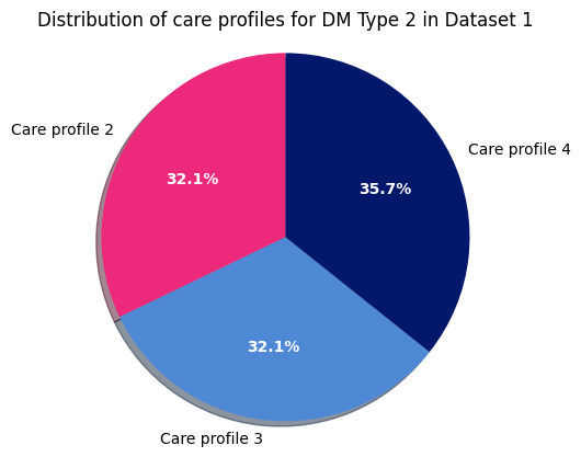
Now we do the same for Type 2 in dataset 1:
# Specify the dataset being analyzed
print("\nDataset 1 - DM Type 2")

# Define the labels for the pie chart
labels = 'Care profile 2', 'Care profile 3', 'Care profile 4'

# Define the sizes of each slice of the pie chart
sizes = [sum((dataset_1["DM Type"]==2) & (dataset_1["zorgprofiel"]==2)),
        sum((dataset_1["DM Type"]==2) & (dataset_1["zorgprofiel"]==3)),
        sum((dataset_1["DM Type"]==2) & (dataset_1["zorgprofiel"]==4))]

# Specify which slice (if any) to separate from the rest of the chart
explode = (0, 0, 0)

# Create a figure with a single subplot and plot the pie chart
fig1, ax1 = plt.subplots()
patches, texts, pcts = ax1.pie(sizes, explode=explode, labels=labels, autopct='%1.1f%%',
                            shadow=True, startangle=90)
plt.setp(pcts, color='white', fontweight=600)

# Ensure that the pie chart is drawn as a circle
ax1.axis('equal')

# Set the title of the pie chart
plt.title("Distribution of care profiles for DM Type 2 in Dataset 1")

# Display the pie chart
plt.show()
Dataset 1 - DM Type 2
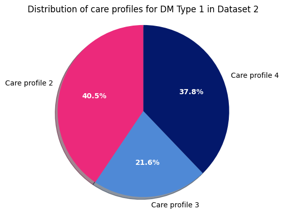
After this we move on to dataset 2 and do the same as above. First Type 1:
# Specify the dataset being analyzed
print("\nDataset 2 - DM Type 1")

# Define the labels for the pie chart
labels = 'Care profile 2', 'Care profile 3', 'Care profile 4'

# Define the sizes of each slice of the pie chart
sizes = [sum((dataset_2["DM Type"]==1) & (dataset_2["zorgprofiel"]==2)),
        sum((dataset_2["DM Type"]==1) & (dataset_2["zorgprofiel"]==3)),
        sum((dataset_2["DM Type"]==1) & (dataset_2["zorgprofiel"]==4))]

# Specify which slice (if any) to separate from the rest of the chart
explode = (0, 0, 0)

# Create a figure with a single subplot and plot the pie chart
fig1, ax1 = plt.subplots()
patches, texts, pcts = ax1.pie(sizes, explode=explode, labels=labels, autopct='%1.1f%%',
                            shadow=True, startangle=90)
plt.setp(pcts, color='white', fontweight=600)

# Ensure that the pie chart is drawn as a circle
ax1.axis('equal')

# Set the title of the pie chart
plt.title("Distribution of care profiles for DM Type 1 in Dataset 2")

# Display the pie chart
plt.show()
Dataset 2 - DM Type 1
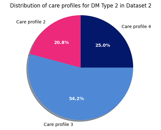
Now Type 2 for dataset 2:
# Specify the dataset being analyzed
print("\nDataset 2 - DM Type 2")

# Define the labels for the pie chart
labels = 'Care profile 2', 'Care profile 3', 'Care profile 4'

# Define the sizes of each slice of the pie chart
sizes = [sum((dataset_2["DM Type"]==2) & (dataset_2["zorgprofiel"]==2)),
        sum((dataset_2["DM Type"]==2) & (dataset_2["zorgprofiel"]==3)),
        sum((dataset_2["DM Type"]==2) & (dataset_2["zorgprofiel"]==4))]

# Specify which slice (if any) to separate from the rest of the chart
explode = (0, 0, 0)

# Create a figure with a single subplot and plot the pie chart
fig1, ax1 = plt.subplots()
patches, texts, pcts = ax1.pie(sizes, explode=explode, labels=labels, autopct='%1.1f%%',
                            shadow=True, startangle=90)
plt.setp(pcts, color='white', fontweight=600)

# Ensure that the pie chart is drawn as a circle
ax1.axis('equal')

# Set the title of the pie chart
plt.title("Distribution of care profiles for DM Type 2 in Dataset 2")

# Display the pie chart
plt.show()
Dataset 2 - DM Type 2
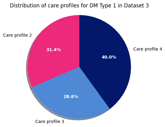
Next, DM Type 1 for dataset 3:
# Specify the dataset being analyzed
print("\nDataset 3 - DM Type 1")

# Define the labels for the pie chart
labels = 'Care profile 2', 'Care profile 3', 'Care profile 4'

# Define the sizes of each slice of the pie chart
sizes = [sum((dataset_3["DM Type"]==1) & (dataset_3["zorgprofiel"]==2)),
        sum((dataset_3["DM Type"]==1) & (dataset_3["zorgprofiel"]==3)),
        sum((dataset_3["DM Type"]==1) & (dataset_3["zorgprofiel"]==4))]

# Specify which slice (if any) to separate from the rest of the chart
explode = (0, 0, 0)

# Create a figure with a single subplot and plot the pie chart
fig1, ax1 = plt.subplots()
patches, texts, pcts = ax1.pie(sizes, explode=explode, labels=labels, autopct='%1.1f%%',
                            shadow=True, startangle=90)
plt.setp(pcts, color='white', fontweight=600)

# Ensure that the pie chart is drawn as a circle
ax1.axis('equal')

# Set the title of the pie chart
plt.title("Distribution of care profiles for DM Type 1 in Dataset 3")

# Display the pie chart
plt.show()
Dataset 3 - DM Type 1
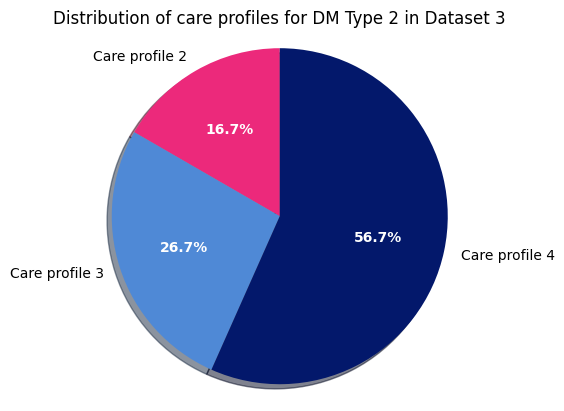
Finally, for DM Type 2 in dataset 3:
# Specify the dataset being analyzed
print("\nDataset 3 - DM Type 2")

# Define the labels for the pie chart
labels = 'Care profile 2', 'Care profile 3', 'Care profile 4'

# Define the sizes of each slice of the pie chart
sizes = [sum((dataset_3["DM Type"]==2) & (dataset_3["zorgprofiel"]==2)),
        sum((dataset_3["DM Type"]==2) & (dataset_3["zorgprofiel"]==3)),
        sum((dataset_3["DM Type"]==2) & (dataset_3["zorgprofiel"]==4))]

# Specify which slice (if any) to separate from the rest of the chart
explode = (0, 0, 0)

# Create a figure with a single subplot and plot the pie chart
fig1, ax1 = plt.subplots()
patches, texts, pcts = ax1.pie(sizes, explode=explode, labels=labels, autopct='%1.1f%%',
                            shadow=True, startangle=90)
plt.setp(pcts, color='white', fontweight=600)

# Ensure that the pie chart is drawn as a circle
ax1.axis('equal')

# Set the title of the pie chart
plt.title("Distribution of care profiles for DM Type 2 in Dataset 3")

# Display the pie chart
plt.show()
Dataset 3 - DM Type 2
Step 3: Looking Deeper Into the Data
In the next part of this tutorial, we will analyze the datasets and get and see how knowing the shape of our data is fundamental for our analysis and the importance of correctly cleaning and labelling
Let’s say we want to perform a similar as before, but focusing on the gender of the participants instead of diabetes type. First, we explore the M/V column (for the Dutch Man/Vrouw for Man/Woman).
# Define table headers
headers= ['Dataset', '% Men', '% Women']

# Calculate the relative proportions of mean and women in each dataset
table = [["Dataset 1",(sum(dataset_1["M/V"]==0)/len(dataset_1)*100),(sum(dataset_1["M/V"]==1)/len(dataset_1)*100)],["Dataset 2",(sum(dataset_2["M/V"]==0)/len(dataset_2)*100),(sum(dataset_2["M/V"]==1)/len(dataset_2)*100)],["Dataset 3",(sum(dataset_3["M/V"]==0)/len(dataset_3)*100),(sum(dataset_3["M/V"]==1)/len(dataset_3)*100)]]


# Print the table with the calculated proportions using the tabulate library
>>> print(tabulate(table, headers=headers, tablefmt='psql'))
    +-----------+---------+-----------+
    | Dataset   |   % Men |   % Women |
    |-----------+---------+-----------|
    | Dataset 1 |      53 |        47 |
    | Dataset 2 |      37 |        33 |
    | Dataset 3 |      42 |        58 |
    +-----------+---------+-----------+
This result is strange, we are computing the percentage of men and women, yet the percentages in Dataset 2 do not add up to one hundred. There is something unusual in the database for that source. As we do not have direct access to the data, we can try to see if we have similar data. using the same structure of queries, let’s see if the database has some values that are close, like -1 or 2.
# Define table headers
headers= ['0', '1', '-1','2']

# Count the number of entries of each type
table = [[(sum(dataset_2["M/V"]==0)),(sum(dataset_2["M/V"]==1)),(sum(dataset_2["M/V"]==-1)),(sum(dataset_2["M/V"]==2))]]


# Print the table with the calculated proportions using the tabulate library
>>> print(tabulate(table, headers=headers, tablefmt='psql'))
    +-----+-----+------+-----+
    |   0 |   1 |   -1 |   2 |
    |-----+-----+------+-----|
    |  37 |  33 |    0 |  30 |
    +-----+-----+------+-----+
We got lucky here, we found that the remaining rows have the value 2. Of course, in order to know what this means we must contact the data owner to explain the meaning of the data. In this case, we know that Hospital 2 marked whether the information was filled out by the caregiver in the M/V. [1] This means that we have lost data in that case. We can still filter using only the values for zero and one.
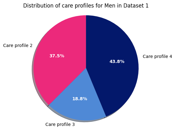
Now let’s create a pie chart to visualize the relative distribution of care profiles for men in dataset 1.
print("\n\n\nQuestion 4: What is the relative distribution of care profiles within a certain gender \n")

print("Dataset 1 - Men")

# Define the labels for the pie chart
labels = 'Care profile 2', 'Care profile 3', 'Care profile 4'

# Define the sizes of each slice in the pie chart
sizes = [sum((dataset_1["M/V"]==0) & (dataset_1["zorgprofiel"]==2)),
        sum((dataset_1["M/V"]==0) & (dataset_1["zorgprofiel"]==3)),
        sum((dataset_1["M/V"]==0) & (dataset_1["zorgprofiel"]==4))]

# Define the amount of "explode" for each slice (i.e. how far apart it should be from the center)
explode = (0, 0, 0)

# Create a new figure and axes for the pie chart
fig1, ax1 = plt.subplots()

# Create the pie chart using the defined parameters
patches, texts, pcts = ax1.pie(sizes, explode=explode, labels=labels, autopct='%1.1f%%',
                            shadow=True, startangle=90)
plt.setp(pcts, color='white', fontweight=600)

# Set the aspect ratio of the axes to be equal so that the pie chart is circular
ax1.axis('equal')

# Add a title to the pie chart
plt.title("Distribution of care profiles for Men in Dataset 1")

# Display the pie chart
plt.show()
Question 4: What is the relative distribution of care profiles within a certain gender

Dataset 1 - Men
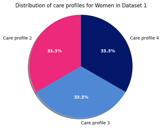
Next, we can take a look using a pie chart for women in dataset 1:
print("\nDataset 1 - Women")

# Define the labels for the pie chart
labels = 'Care profile 2', 'Care profile 3', 'Care profile 4'

# Define the sizes of each slice in the pie chart
sizes = [sum((dataset_1["M/V"]==1) & (dataset_1["zorgprofiel"]==2)),
        sum((dataset_1["M/V"]==1) & (dataset_1["zorgprofiel"]==3)),
        sum((dataset_1["M/V"]==1) & (dataset_1["zorgprofiel"]==4))]

# Define the amount of "explode" for each slice (i.e. how far apart it should be from the center)
explode = (0, 0, 0)

# Create a new figure and axes for the pie chart
fig1, ax1 = plt.subplots()

# Create the pie chart using the defined parameters
patches, texts, pcts = ax1.pie(sizes, explode=explode, labels=labels, autopct='%1.1f%%',
                            shadow=True, startangle=90)
plt.setp(pcts, color='white', fontweight=600)

# Set the aspect ratio of the axes to be equal so that the pie chart is circular
ax1.axis('equal')

# Add a title to the pie chart
plt.title("Distribution of care profiles for Women in Dataset 1")

# Display the pie chart
plt.show()
Dataset 1 - Women
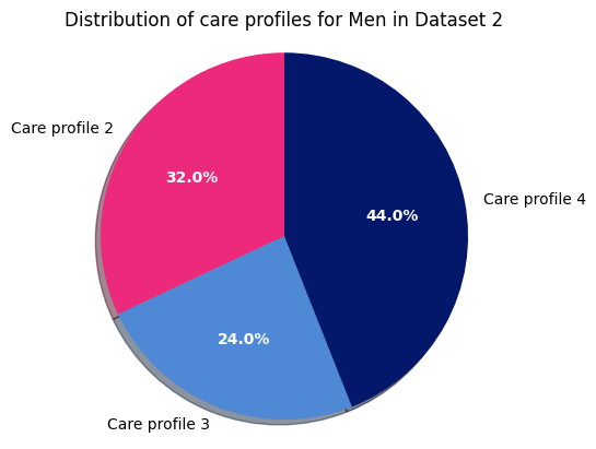
Next, for men in dataset 2:
print("\nDataset 2 - Men")

labels = 'Care profile 2', 'Care profile 3', 'Care profile 4'
sizes = [sum((dataset_2["M/V"]==0) & (dataset_2["zorgprofiel"]==2)),
sum((dataset_2["M/V"]==0) & (dataset_2["zorgprofiel"]==3)),
sum((dataset_2["M/V"]==0) & (dataset_2["zorgprofiel"]==4))]

explode = (0, 0, 0)  # only "explode" the 2nd slice

fig1, ax1 = plt.subplots()
patches, texts, pcts = ax1.pie(sizes, explode=explode, labels=labels, autopct='%1.1f%%',
                            shadow=True, startangle=90)
plt.setp(pcts, color='white', fontweight=600)
ax1.axis('equal')  # Equal aspect ratio ensures that pie is drawn as a circle.

plt.title("Distribution of care profiles for Men in Dataset 2")

plt.show()
Dataset 2 - Men
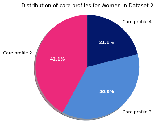
Next, the percentage distribution of different care profiles for women in dataset 2:
print("\nDataset 2 - Women")

# Define the labels for the pie chart
labels = 'Care profile 2', 'Care profile 3', 'Care profile 4'

# Define the sizes of each slice in the pie chart
sizes = [sum((dataset_2["M/V"]==1) & (dataset_2["zorgprofiel"]==2)),
        sum((dataset_2["M/V"]==1) & (dataset_2["zorgprofiel"]==3)),
        sum((dataset_2["M/V"]==1) & (dataset_2["zorgprofiel"]==4))]

# Define the amount of "explode" for each slice (i.e. how far apart it should be from the center)
explode = (0, 0, 0)

# Create a new figure and axes for the pie chart
fig1, ax1 = plt.subplots()

# Create the pie chart using the defined parameters
patches, texts, pcts = ax1.pie(sizes, explode=explode, labels=labels, autopct='%1.1f%%',
                            shadow=True, startangle=90)
plt.setp(pcts, color='white', fontweight=600)

# Set the aspect ratio of the axes to be equal so that the pie chart is circular
ax1.axis('equal')

# Add a title to the pie chart
plt.title("Distribution of care profiles for Women in Dataset 2")

# Display the pie chart
plt.show()
Dataset 2 - Women
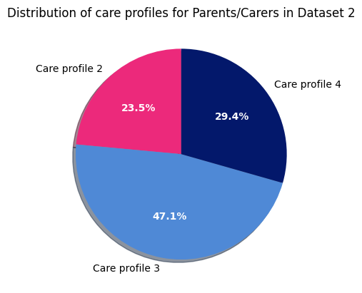
The following is an interesting example of properly cleaning and defining the data before uploading it to the engine Here we will visualize the distribution of care profiles for parents/guardians in dataset 2:
# Print title
print("\nDataset 2 - Parents/Carers")

# Define labels and sizes for pie chart
labels = 'Care profile 2', 'Care profile 3', 'Care profile 4'
sizes = [sum((dataset_2["M/V"]==2) & (dataset_2["zorgprofiel"]==2)),
        sum((dataset_2["M/V"]==2) & (dataset_2["zorgprofiel"]==3)),
        sum((dataset_2["M/V"]==2) & (dataset_2["zorgprofiel"]==4))]

# Set explode parameter for pie chart
explode = (0, 0, 0)  # only "explode" the 2nd slice

# Create pie chart with labels, sizes, explode, and formatting parameters
fig1, ax1 = plt.subplots()
patches, texts, pcts = ax1.pie(sizes, explode=explode, labels=labels, autopct='%1.1f%%',
                            shadow=True, startangle=90)
plt.setp(pcts, color='white', fontweight=600)
ax1.axis('equal')  # Equal aspect ratio ensures that pie is drawn as a circle.

# Set title for pie chart
plt.title("Distribution of care profiles for Parents/Carers in Dataset 2")

# Display pie chart
plt.show()
Dataset 2 - Parents/Carers
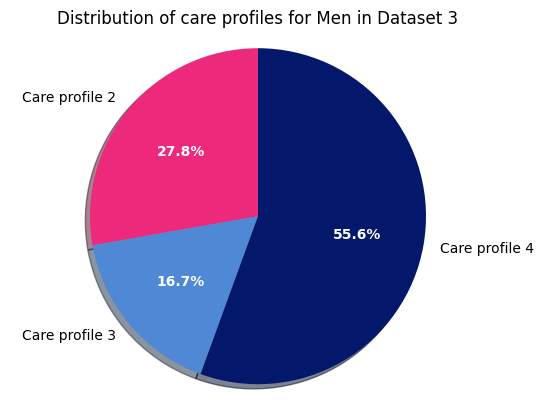
Next, for the distribution of care profiles within men in dataset 3:
print("\nDataset 3 - Men")

labels = 'Care profile 2', 'Care profile 3', 'Care profile 4'
sizes = [sum((dataset_3["M/V"]==0) & (dataset_3["zorgprofiel"]==2)),
sum((dataset_3["M/V"]==0) & (dataset_3["zorgprofiel"]==3)),
sum((dataset_3["M/V"]==0) & (dataset_3["zorgprofiel"]==4))]

explode = (0, 0, 0)  # only "explode" the 2nd slice

fig1, ax1 = plt.subplots()
patches, texts, pcts = ax1.pie(sizes, explode=explode, labels=labels, autopct='%1.1f%%',
                            shadow=True, startangle=90)
plt.setp(pcts, color='white', fontweight=600)
ax1.axis('equal')  # Equal aspect ratio ensures that pie is drawn as a circle.

plt.title("Distribution of care profiles for Men in Dataset 3")

plt.show()
Dataset 3 - Men
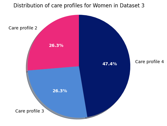
and finally, the distribution of care profiles within women in dataset 3:
print("\nDataset 3 - Women")

labels = 'Care profile 2', 'Care profile 3', 'Care profile 4'
sizes = [sum((dataset_3["M/V"]==1) & (dataset_3["zorgprofiel"]==2)),
sum((dataset_3["M/V"]==1) & (dataset_3["zorgprofiel"]==3)),
sum((dataset_3["M/V"]==1) & (dataset_3["zorgprofiel"]==4))]

explode = (0, 0, 0)  # only "explode" the 2nd slice

fig1, ax1 = plt.subplots()
patches, texts, pcts = ax1.pie(sizes, explode=explode, labels=labels, autopct='%1.1f%%',
                            shadow=True, startangle=90)
plt.setp(pcts, color='white', fontweight=600)
ax1.axis('equal')  # Equal aspect ratio ensures that pie is drawn as a circle.

plt.title("Distribution of care profiles for Women in Dataset 3")

plt.show()
Dataset 3 - Women
To end everything, let’s calculate and display the average age and standard deviation for each of the 3 datasets - and display it in a table:
# Print question header
print("\n\n\nQuestion 5: What is the mean 'Age' and standard deviation of the sample? \n")

# Define column headers for table
headers = ["Dataset", "Mean age", "σ age"]

# Create table as a list of lists with dataset names, mean ages, and standard deviations
table = [["Dataset 1", dataset_1['Leeftijd'].mean(), math.sqrt(dataset_1['Leeftijd'].var())],
        ["Dataset 2", dataset_2['Leeftijd'].mean(), math.sqrt(dataset_2['Leeftijd'].var())],
        ["Dataset 3", dataset_3['Leeftijd'].mean(), math.sqrt(dataset_3['Leeftijd'].var())]]

# Format and display table using tabulate library
print(tabulate(table, headers=headers, tablefmt='psql'))
Question 5: What is the mean 'Age' and standard deviation of the sample?

+-----------+-----------------------+--------------+
| Dataset   |              Mean age |        σ age |
|-----------+-----------------------+--------------|
| Dataset 1 |                 50.53 |      26.8883 |
| Dataset 2 |                 56.69 |      27.1337 |
| Dataset 3 |                 53.73 |      27.3912 |
+-----------+-----------------------+--------------+